Zach Johnson


How do we create a fun, welcoming visual identity for a hackathon? How can we use design to increase the quality and diversity of attendees?
How do we create a fun, welcoming visual identity for a hackathon? How can we use design to increase the quality and diversity of attendees?
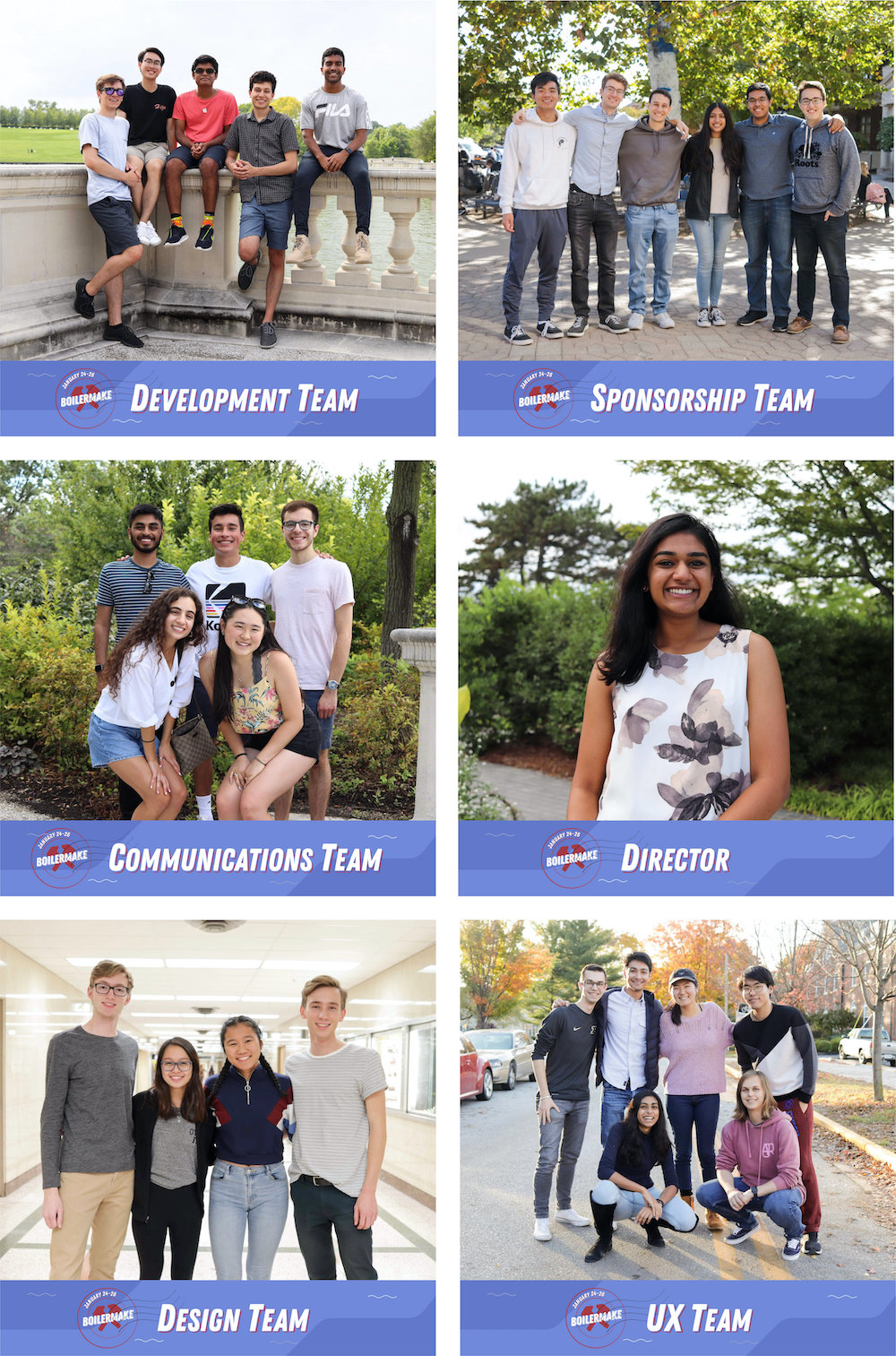
Design Team Lead, Designer
October 2018 - Present
Max Cherbak, designer
Julien San Diego, designer
Vicki Liu, designer
Sketch, Affinity Designer, InVision, After Effects
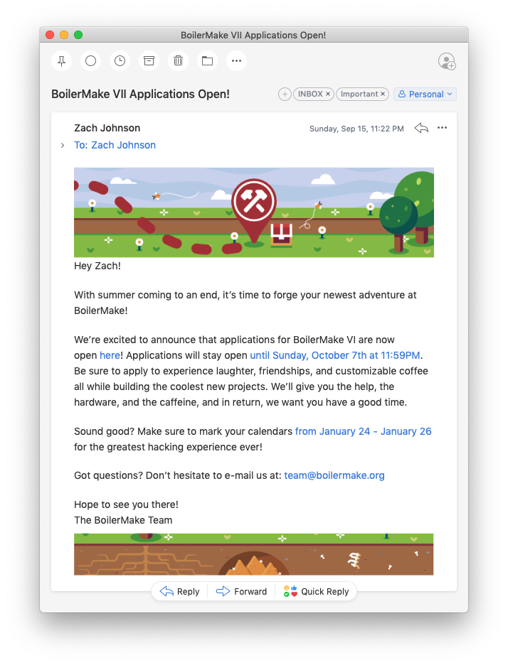
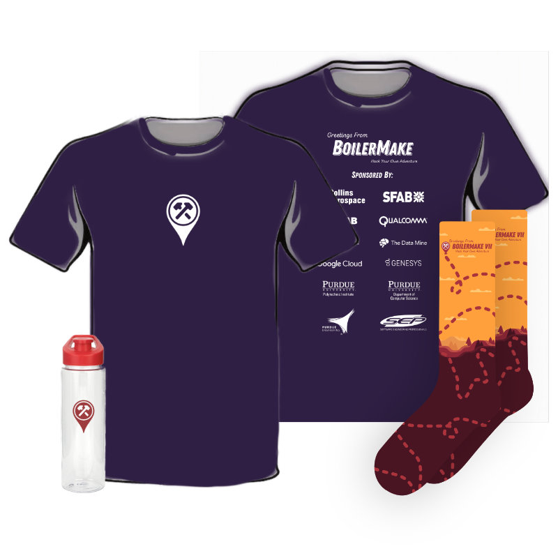
BoilerMake is Purdue’s annual hackathon. As a design team, we create all of the branding, posters, and other visual assets for the weekend-long event, in addition to designing the website.
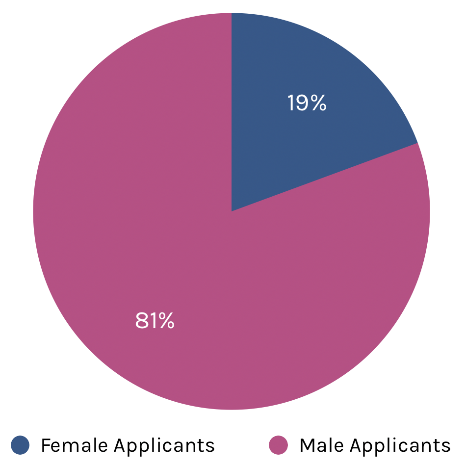
Typically, our hackers are predominantly white, male, and upperclassmen. Many don’t stay for the entire event. As a team, we made it our goal to use our designs to invite a younger, more diverse group of hackers who want to stay and participate for the entire event.
Previously, the design team operated inefficiently. Different designers used different software, communication lacked, and it led to inconsistency and headaches for everyone involved. Using the skills I learned at my internship with Aetna Digital, I developed the following goals for the team:
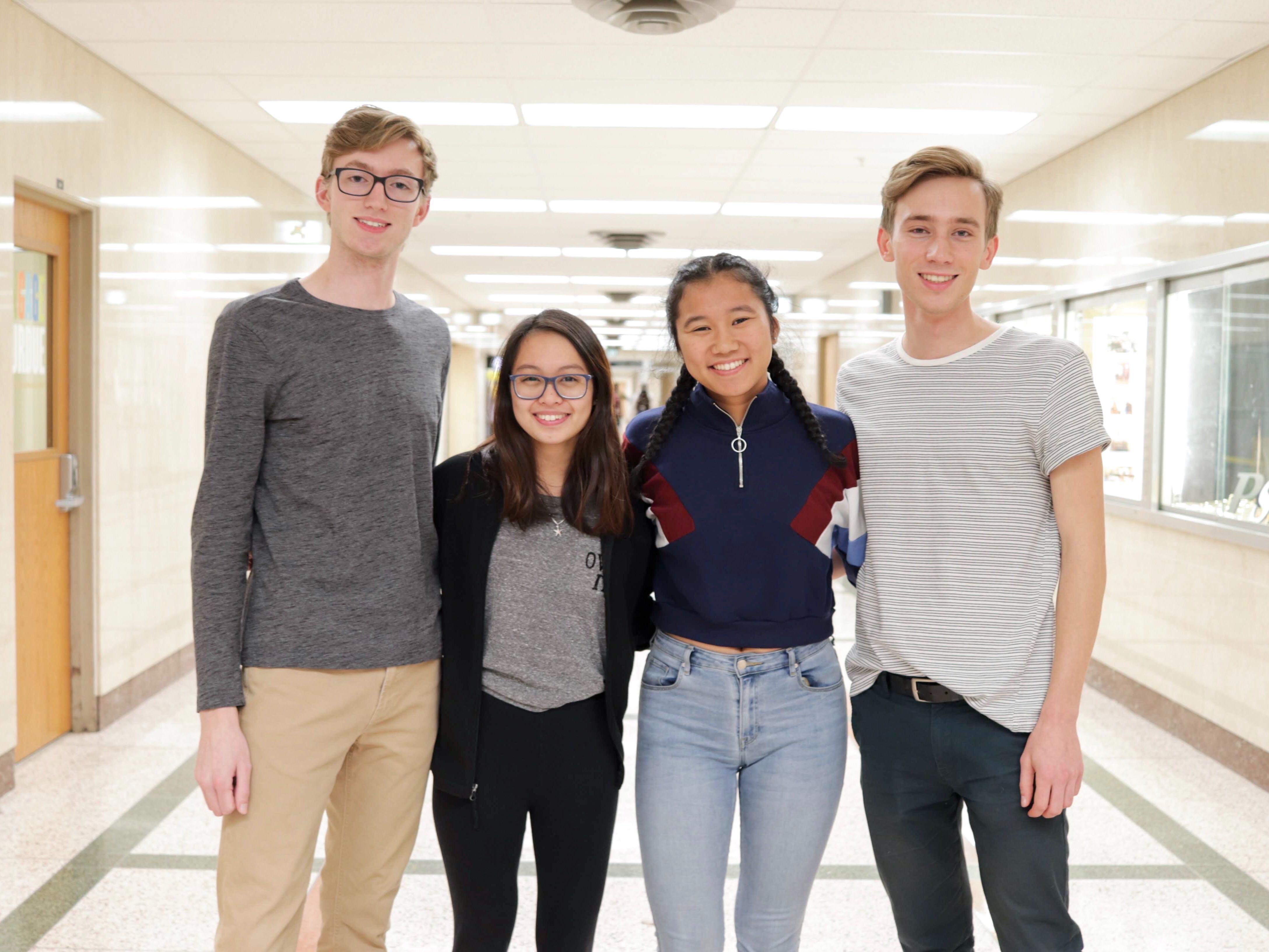
The BoilerMake VII design team.
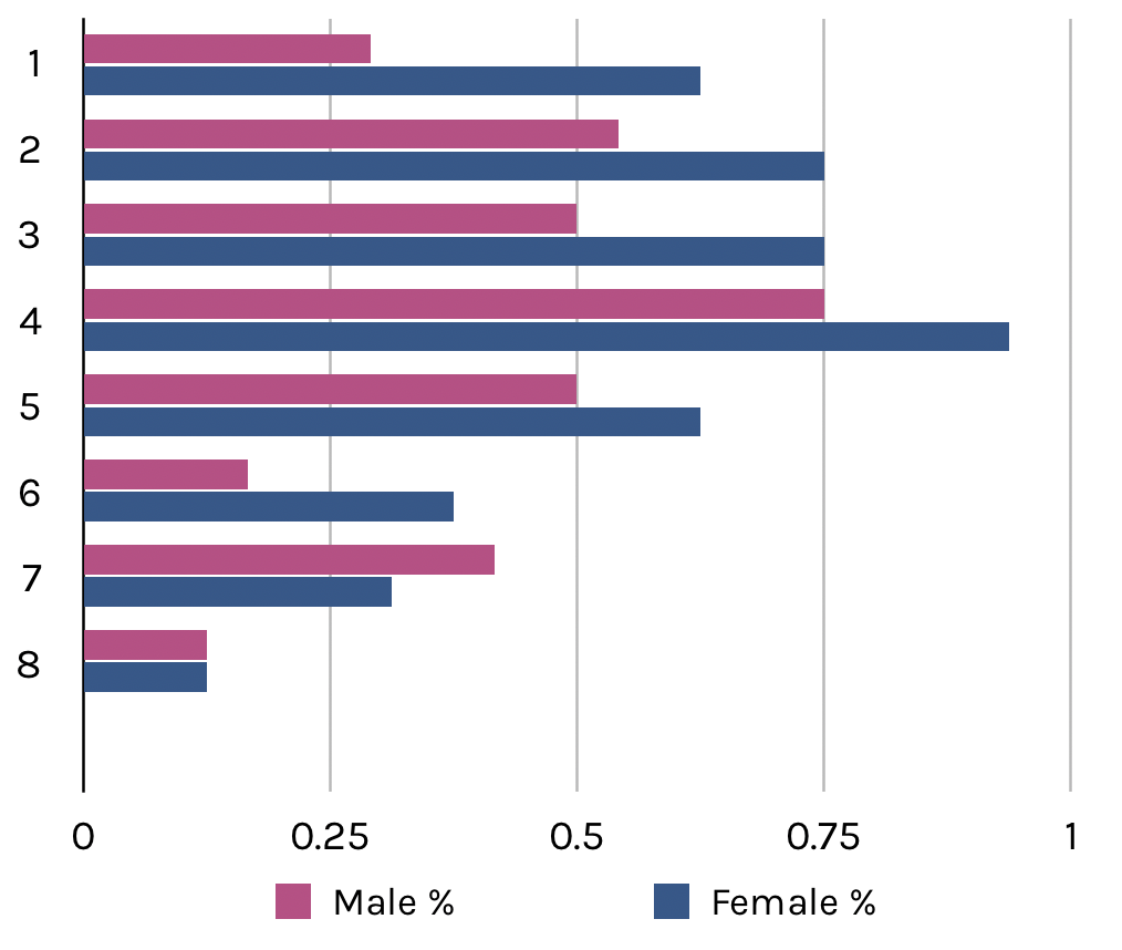
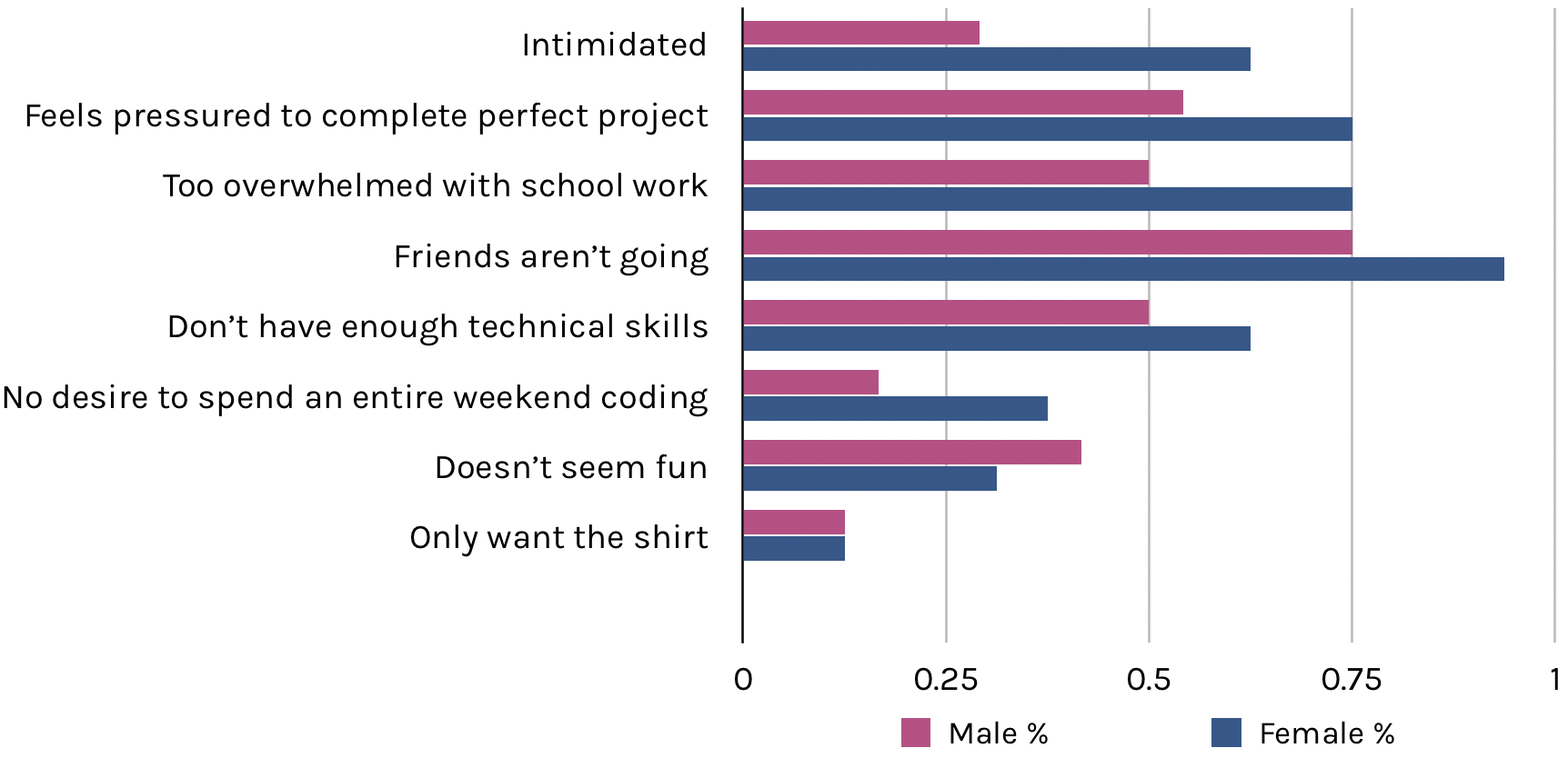
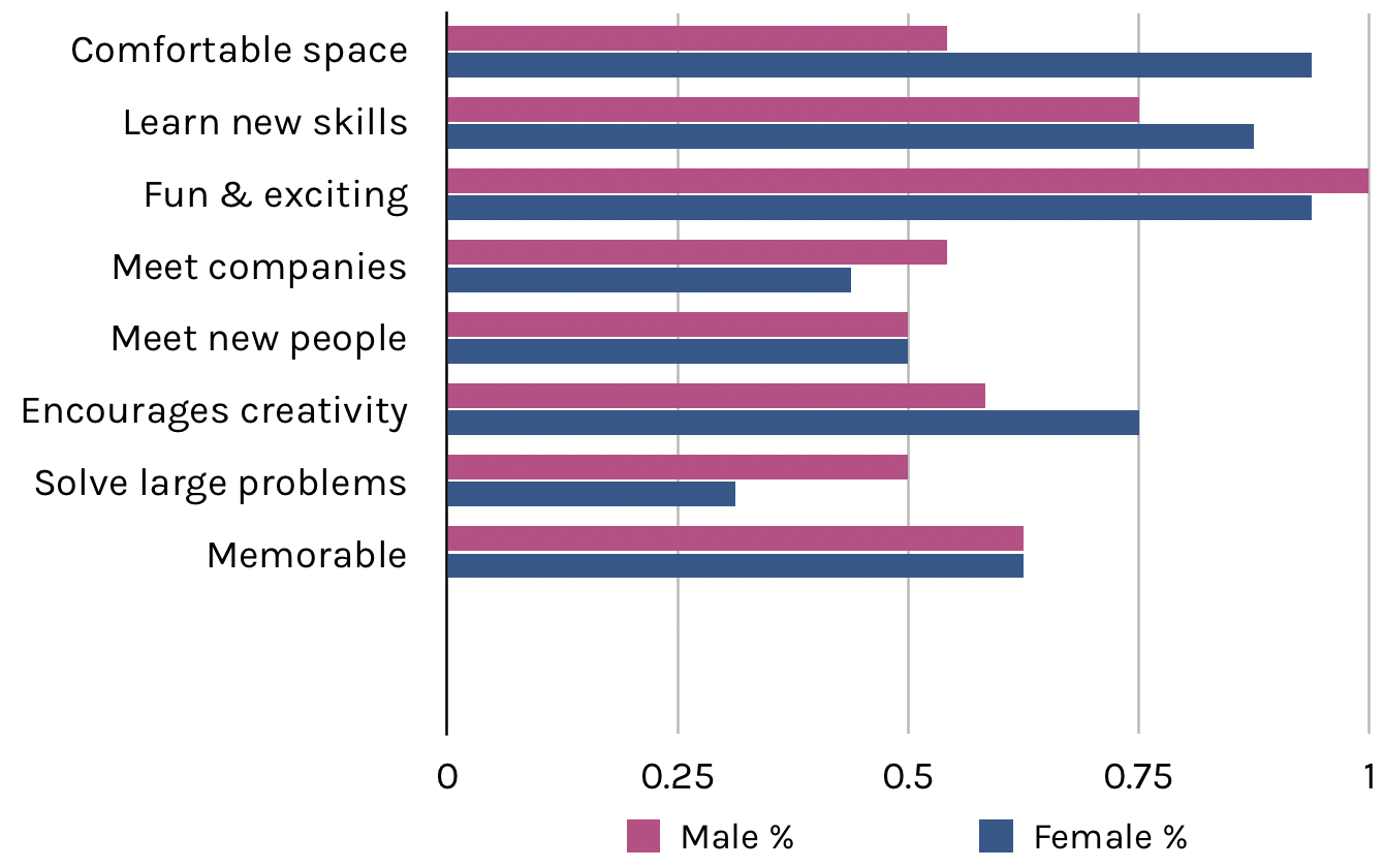
Before defining any goals for ourselves, we set out to learn more about the feelings people have associated with hackathons. Each of the 4 designers talked to 10 first and second year CS, engineering, and design students. We asked questions and started a dialogue with each person, collecting data along the way. Here's what we learned!
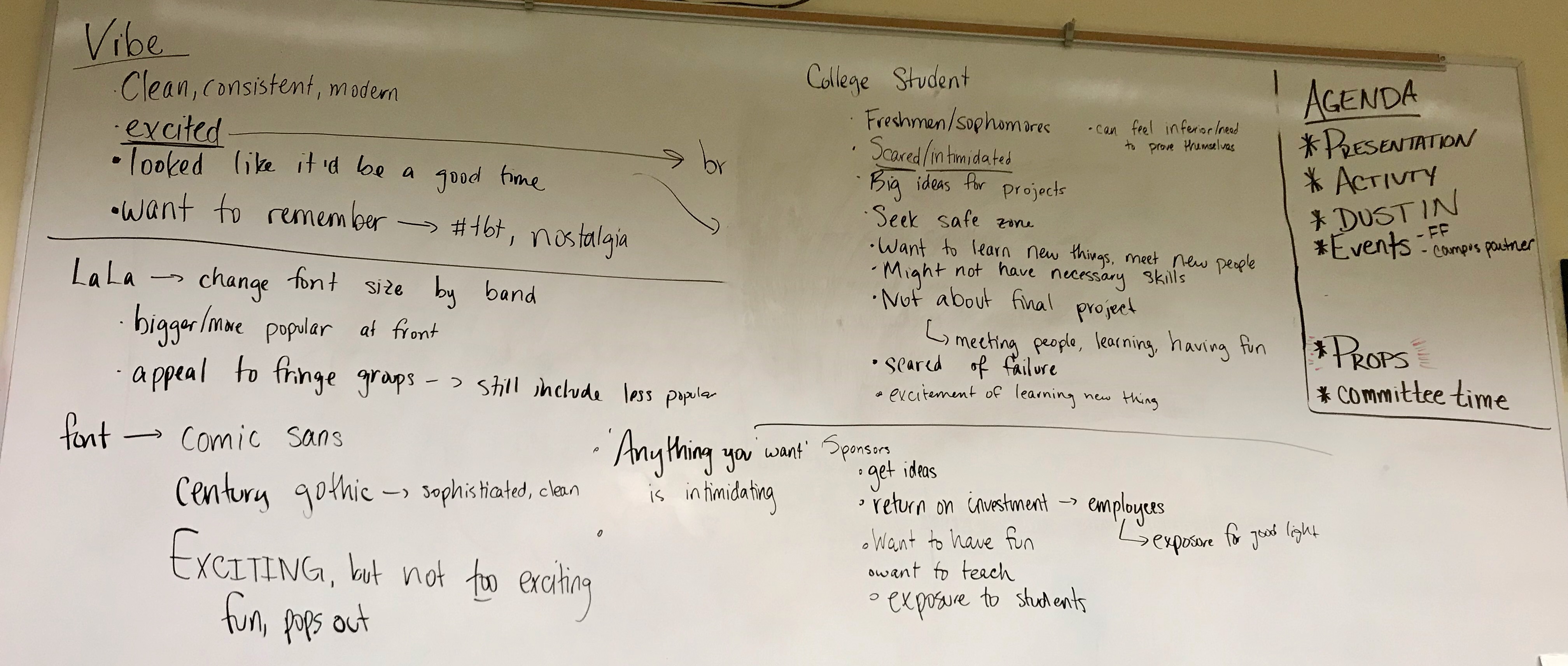
Because we’re a free event that costs a lot of money, we have a lot of sponsors. This creates an interesting challenge where we’re designing for two groups of people with very different goals. These are the user personas we based our designs on:
After collecting all of this information, we began brainstorming a theme that encompassed the lessons we learned from our research.
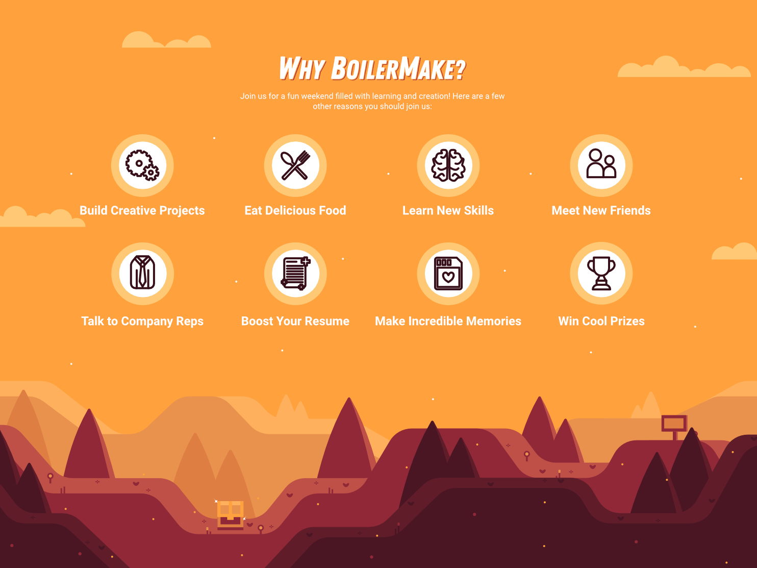
First, we started developing the goals we wanted for our BoilerMake. As previously mentioned, we settled on the idea of BoilerMake existing as a weekend for people to come, work on creative projects, and learn new skills. We want our event to have a fun, inviting atmosphere where people feel comfortable to make mistakes and learn along the way.
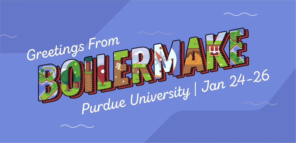
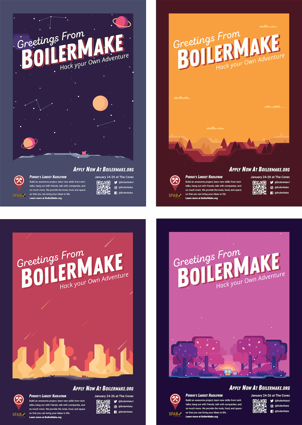
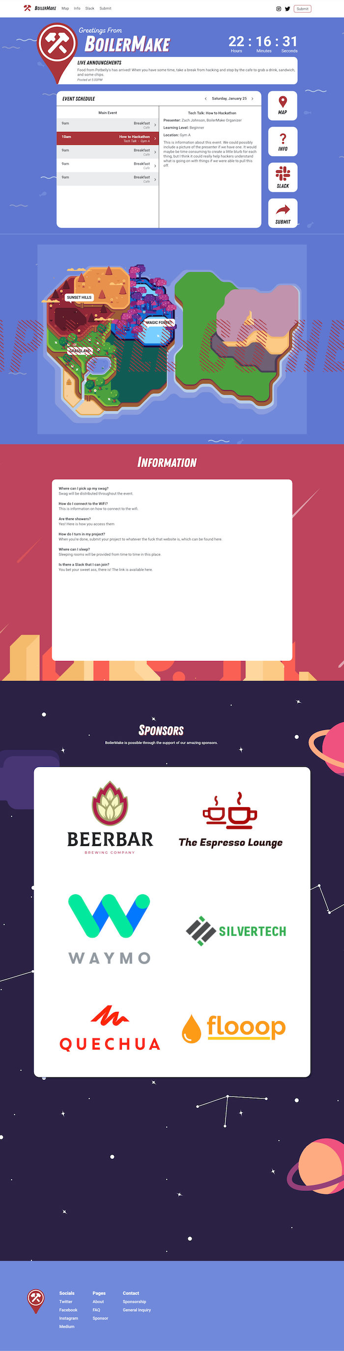
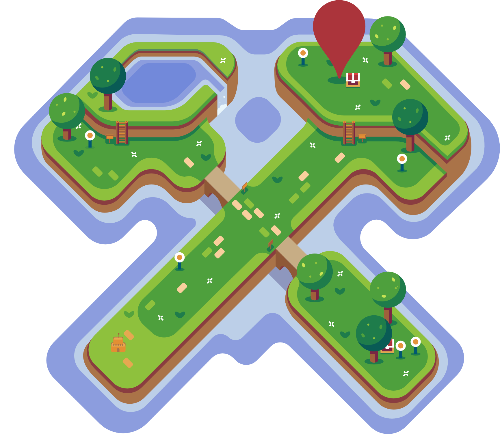
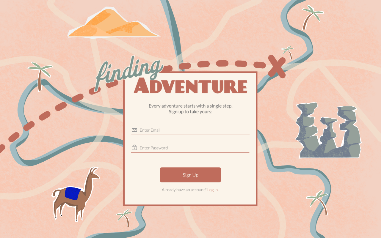
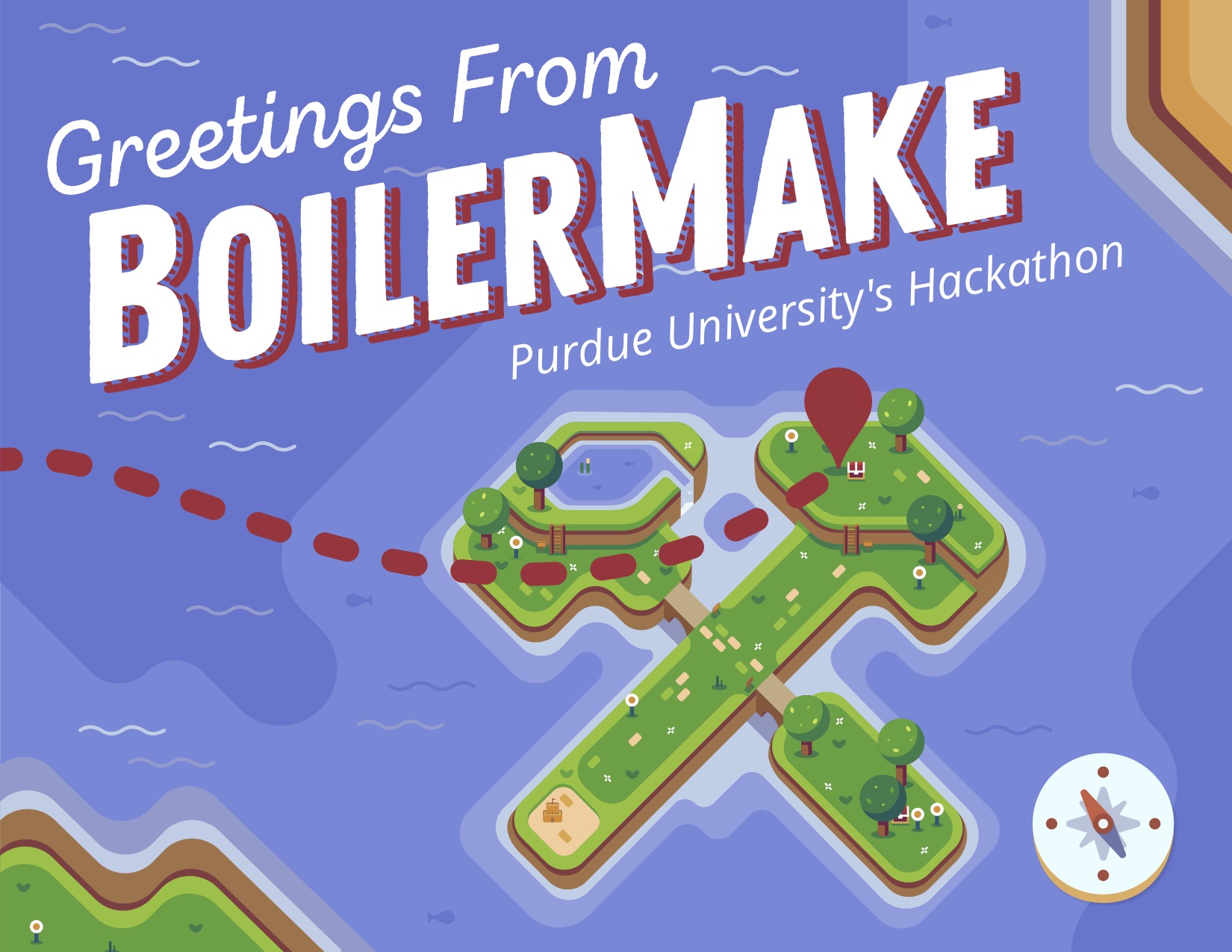
With this in mind, we settled on the idea of a 'choose your own adventure' theme. It inherently has a fun, exciting feel to it based on the connotations associated with traveling, but also fits the goals we defined above.
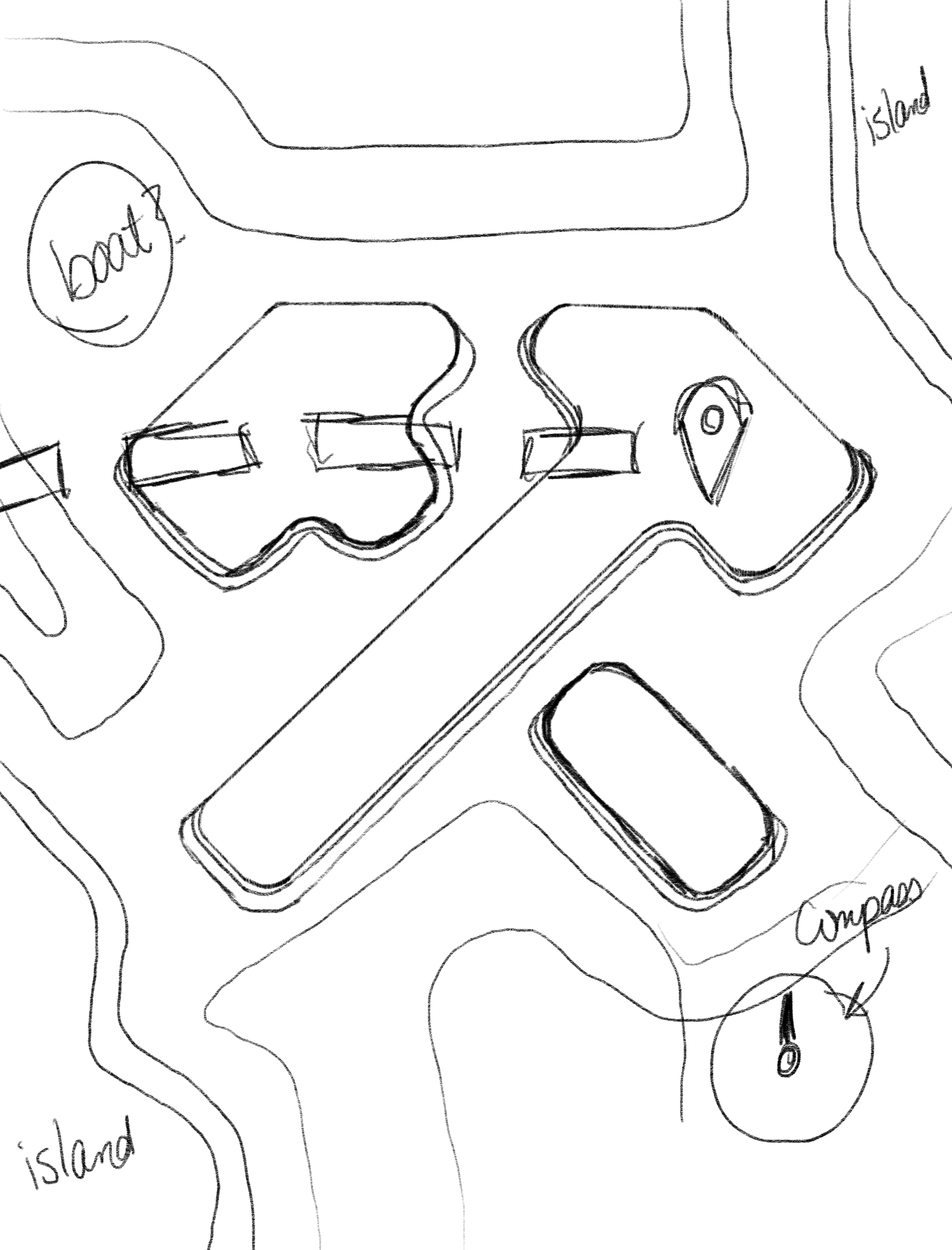
So. We wanted people to feel like they were choosing their own adventure. How do we represent that visually? Each designer spent some time sketching and mocking-up possible designs. After gathering these possible visuals, we had a design critique and sent what we colloquially called the "Peach Map" to the BoilerMake Team for feedback.
I'll spare you the time of reading the details of the feedback, but they were essentially this: nope.
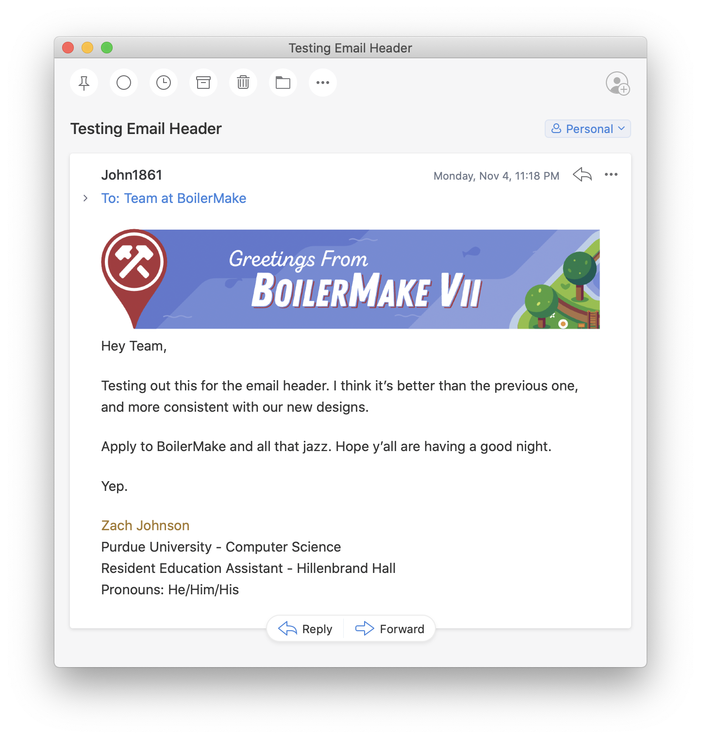
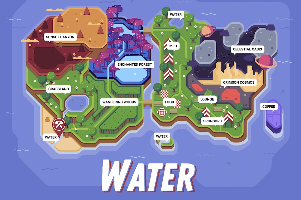
After receiving that feedback, we went back to the drawing board. People didn't instantly recognize it as a map, the colors did not feel like an adventure, and it failed to convey the emotions we want people to feel while viewing our materials. We wanted folks to feel excited by the possibilities of the weekend, safe to attend and learn, and no intimidation by unrealistically high technical bars. We realized that this fits with casual video games like Stardew Valley or Animal Crossing. We found some inspiration and started sketching out this idea, finally landing on our final design.
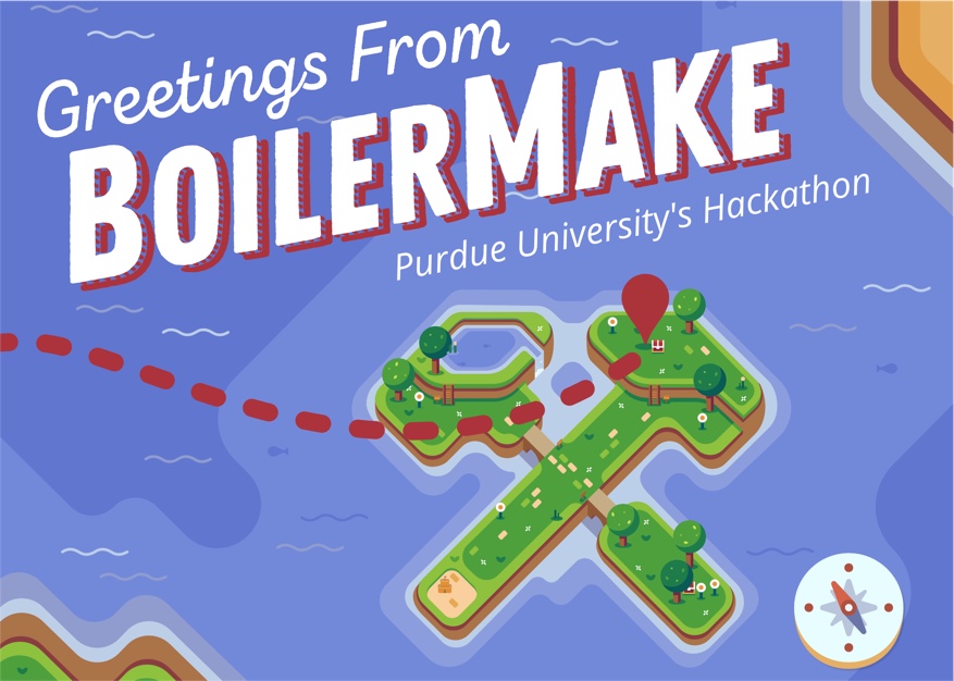
This time, except for some minor aesthetic changes, the feedback was much more positive! So we decided to move forward with this design.
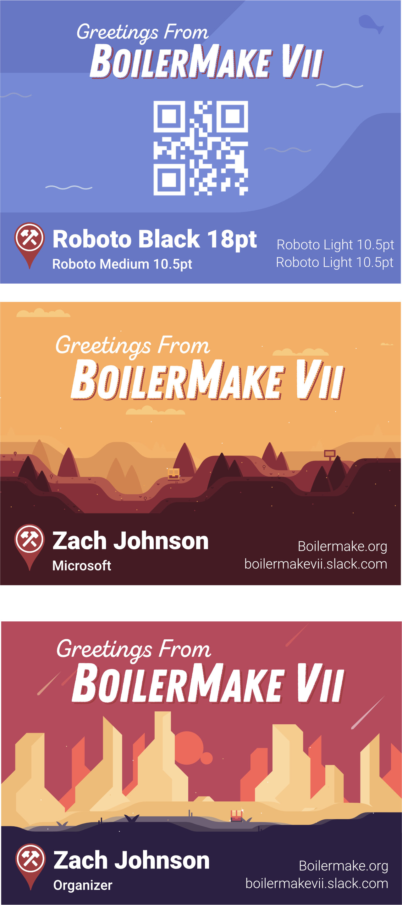
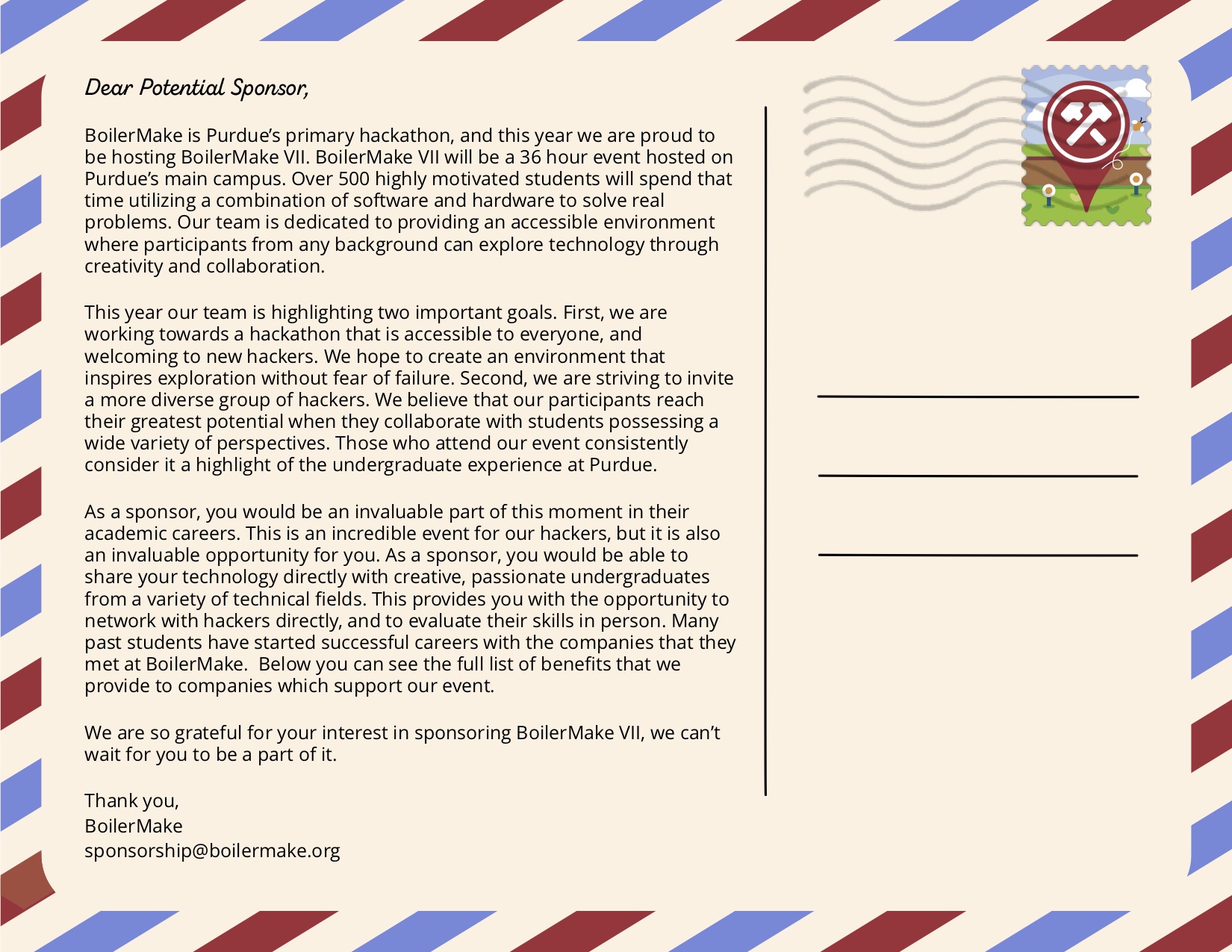
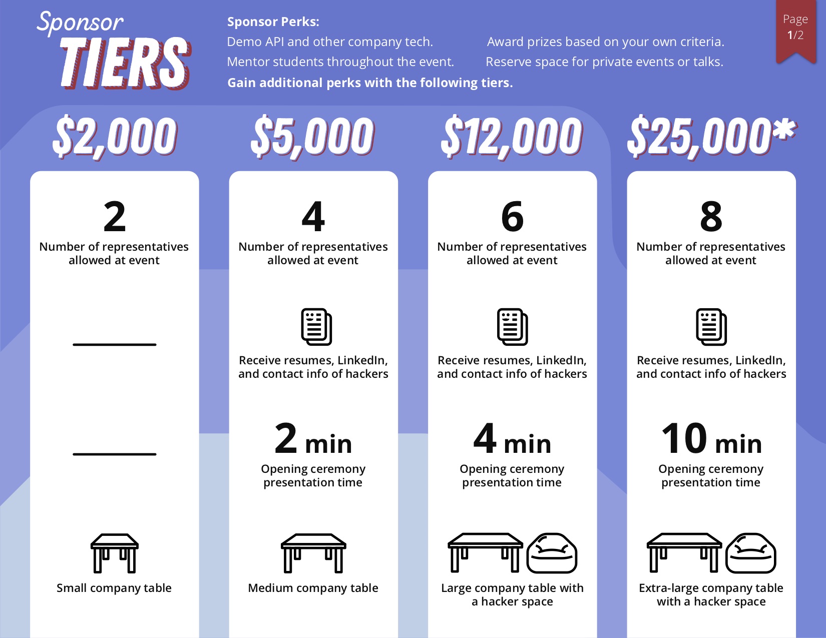
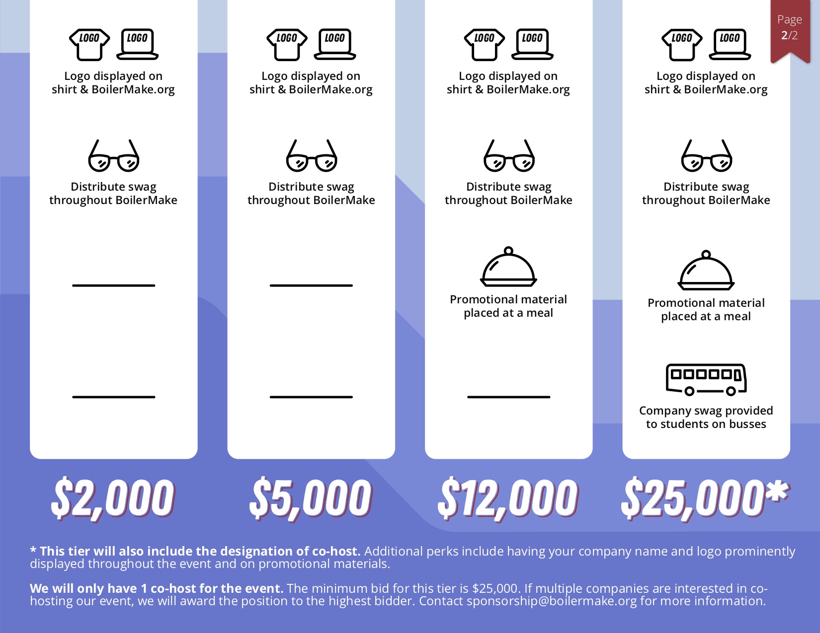
Our first big deliverable was the Sponsorship Packet. This is the PDF that the Sponsorship team sends to hundreds of companies to build a relationship with recruiters and receive funding. Using our new theme in mind, we worked with the sponsorship team to learn what information they want included and how best to beneficially represent that information. The sponsorship packet is our first chance to solidify our designs and begin developing our visual identity and design standards.
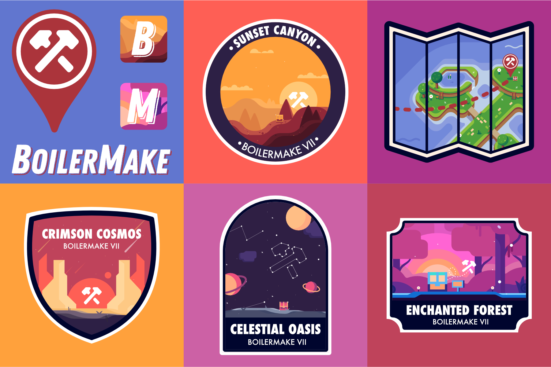
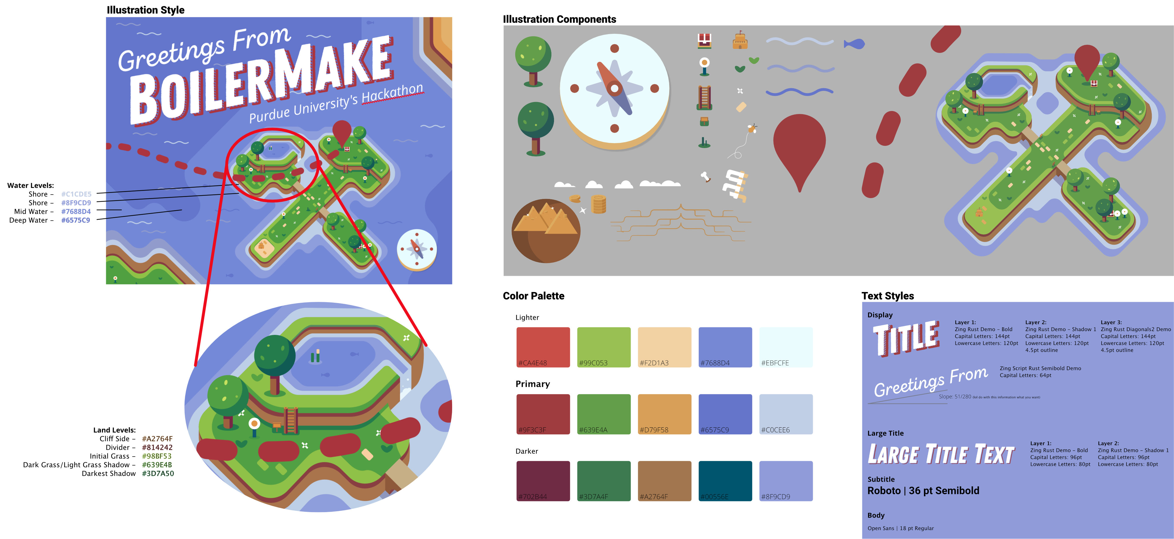
Now that the Sponsorship Packet was complete, before diving into the numerous other projects the design team had on our todo list, we created a style guide to help ensure consistency and, honestly, make our lives a whole lot easier. We created an Affinity Designer file with all of our illustrations, fonts, and other assets that we routinely expanded as needed.
I am so proud of the work that our team is doing. We're full-time students who volunteer our time for a student organization that quickly revamps its entire visual identity on a yearly basis — that's a lot of work, and every member of this team devotes a lot of time and energy to create our designs.
That being said, there are some thing I'd change about our process. For example, we did a lot of research right off the bat, but I'd love to take our current final branding to prospective hackers, seeing if it conveys the proper message. I'd love to improve our social media presence to build hype for our event throughout the year. I'd love to meet more often than once a week for design reviews.
Regardless, as I said before, I'm so proud of the work we're producing and I have no doubt the team will continue to improve our process and deliverables year after year.
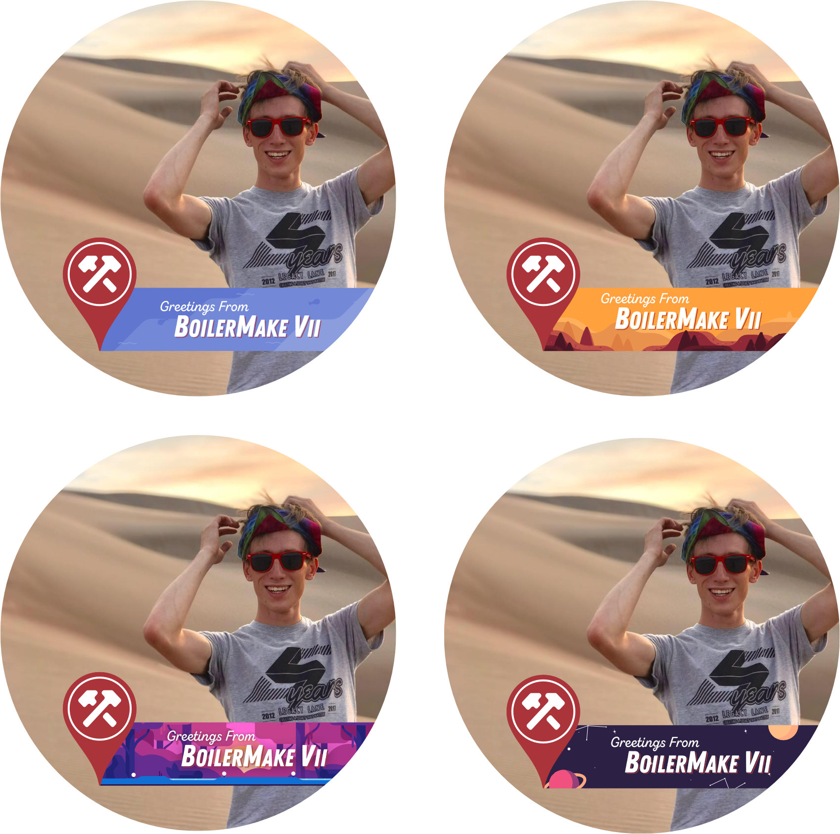
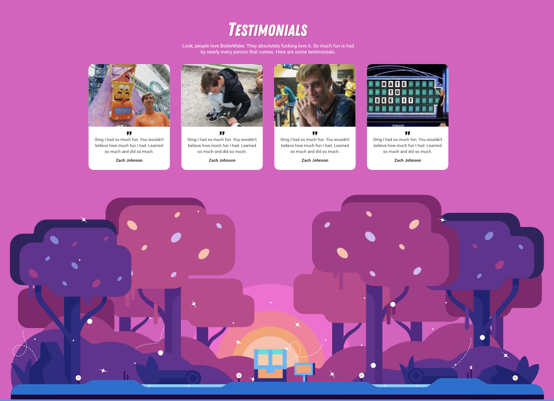
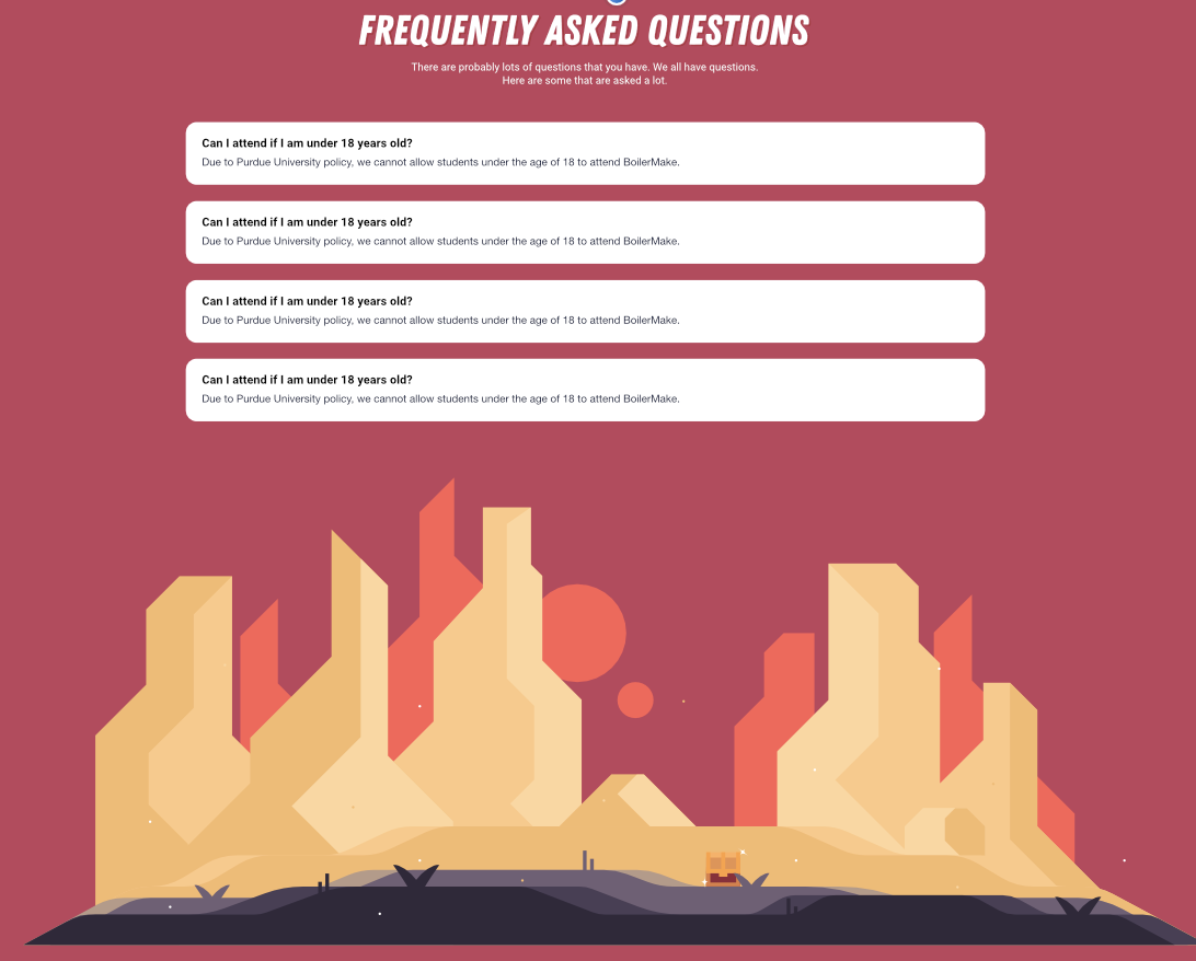
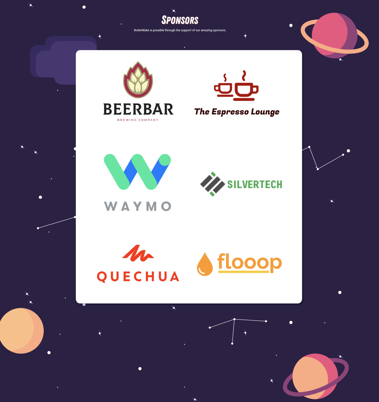
We’re still have a long list of projects coming down the pipeline, but here are some of our other designs that we’ve made thus far! We're currently working on creating new illustrations to expand the idea of "choosing your own adventure", designing presentation slides, social media images, and posters.