Zach Johnson


How do we create a fun, welcoming visual identity for a hackathon? How can we use design to increase the quality and diversity of attendees?
Colorectal cancer is the second leading cause of deaths from cancer in the US. How can we use Aetna's resources to help increase screenings?

UI Design Intern
June - August 2018
5 UI designers
3 Copy writers
5 UX designers
3 Accessibility testers
Sketch, InVision, GitHub
I joined Aetna Digital's design team as a UI design intern as the team worked to add new features to the Aetna Health application. It was an incredible opportunity — taking the complexities of health insurance and creating a user-friendly application is no easy task. The design team referred to itself as team MISL: Make Insurance Suck Less.
This case study focuses on the intern capstone project. I worked with five interns from various other fields; we had interns from development, business, and marketing represented. We were tasked with designing a solution to some sort of health equity problem.
A team member had a family member die from colorectal cancer, so we decided to look into the problems affecting this cancer. To learn more, we began researching some statistics. (source)
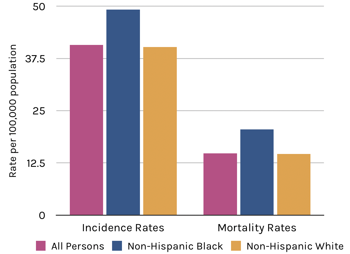
Average Age when Diagnosed
Leading Cause of Cancer Death
Five-Year Survival Rate
Five-Year Survival Rate,
with early screenings
Diving deeper into our research, we also found that colorectal cancer disproponately affects men and women of color when compared with the non-hispanic white population. Incidence rates are 20% higher for black populations, and mortality rates are 40% higher for black communities.
Research suggests these differences largely reflect differences in socioeconomic status and education levels. This largely stems from the prevalence of risk factors in these communities (smoking, obesity, etc.) and the lack of screenings.
Solving the root causes of socioeconomic disparities via a summer internship and iOS application is unlikely. This presented a problem — if our goal is to find an equitable solution to a health disparity facing our nation, do we move forward with our research, or go back to the drawing board to find another problem. To be entirely honest, we were short for time at this point, so we chose to move forward and research why people from these communities are less likely to get colorectal cancer screenings. We learned the following.
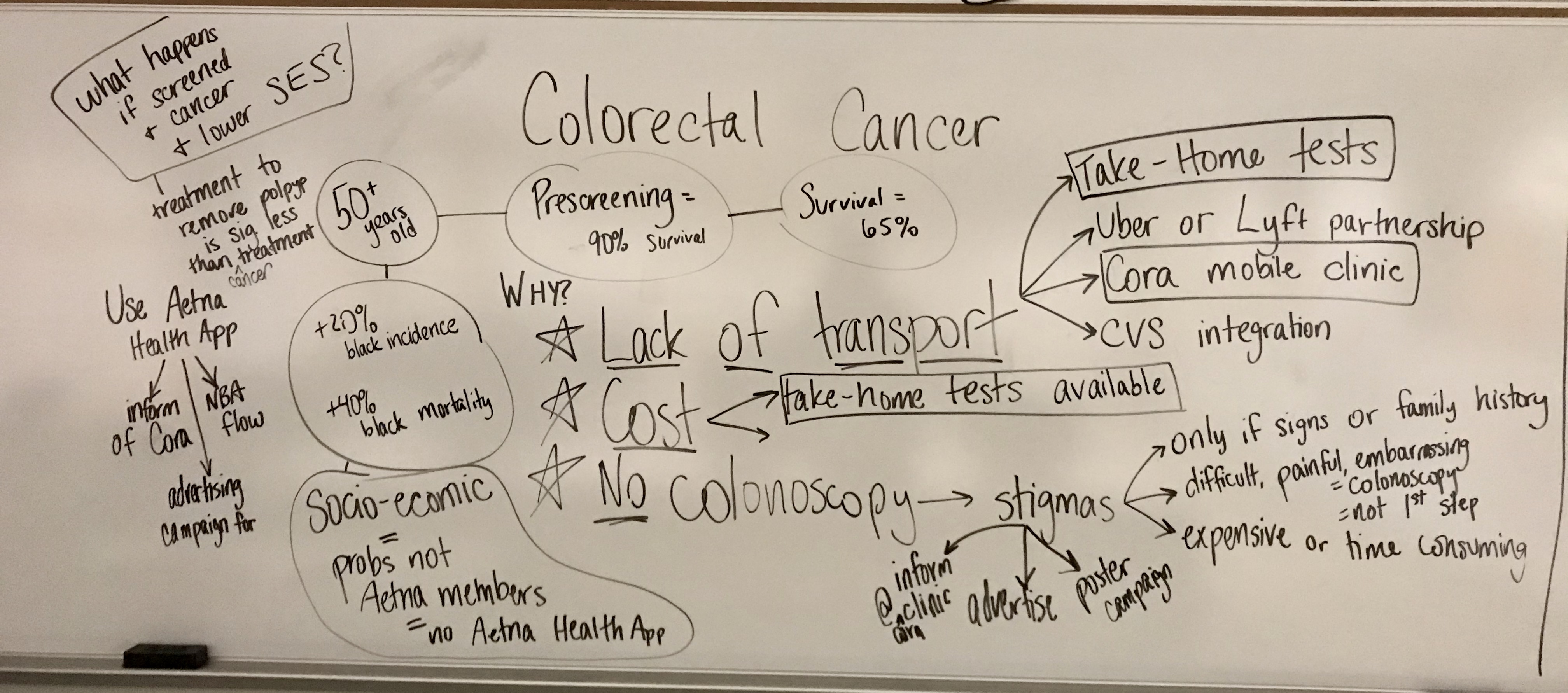
This is a lot of data, and a very complex problem. To brainstorm solutions, we decided to use a good, 'ol-fashioned whiteboard so we could get ideas and thoughts out of our minds. Here's a picture of our brain map, cleaned up a little bit for readability:
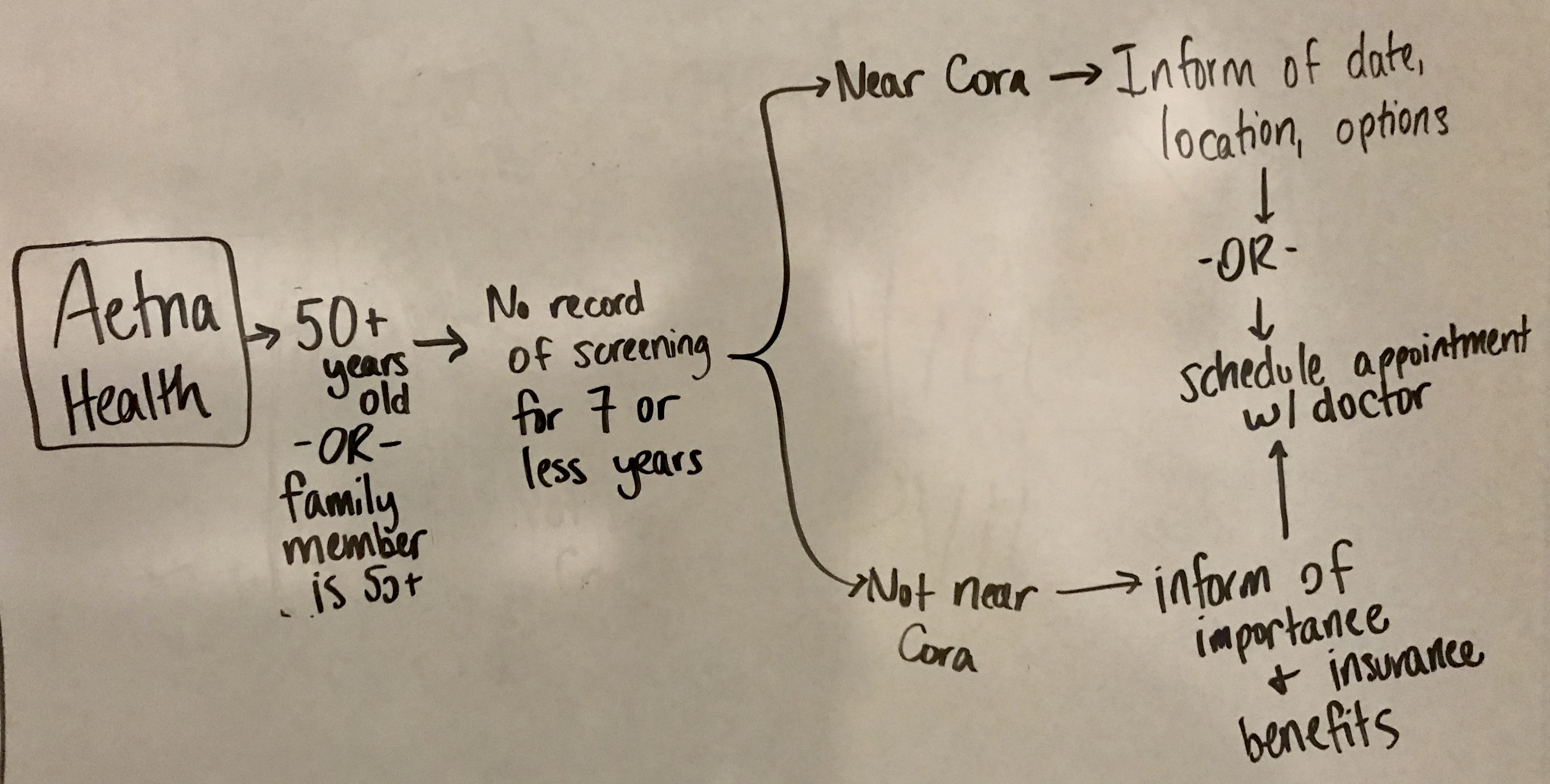
We devised a plan that we think helps meet our goal while using Aetna's existing resources, therefore helping Aetna as a whole. It consists of 2 parts.
Our goal is to be equitable for those who would not normally have access to testing. By utilizing resources such as take-home tests or Aetna'a Cora mobile clinic, we can increase testing while tackling the major problems of transportation and cost.
Many of the stigmas surrounding colorectal cancer screenings stem from misinformation being passed by word of mouth. By utilizing the Aetna Health application and a targeted ad campaign, we can increase awareness for the types of screenings available while displaying the importance of being screened.
I was tasked with creating a user flow to increase awareness through the Aetna Health application. Luckily, the design team had already solidified a user flow they called 'Next Best Action', or NBA.
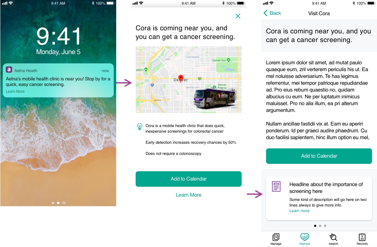
NBA flows are designed to inform users of actions they can take to improve their health. It generally starts with a notification that opens a pop-up in the app. This pop-up shares general information with the option of viewing more, or completing a designated action.
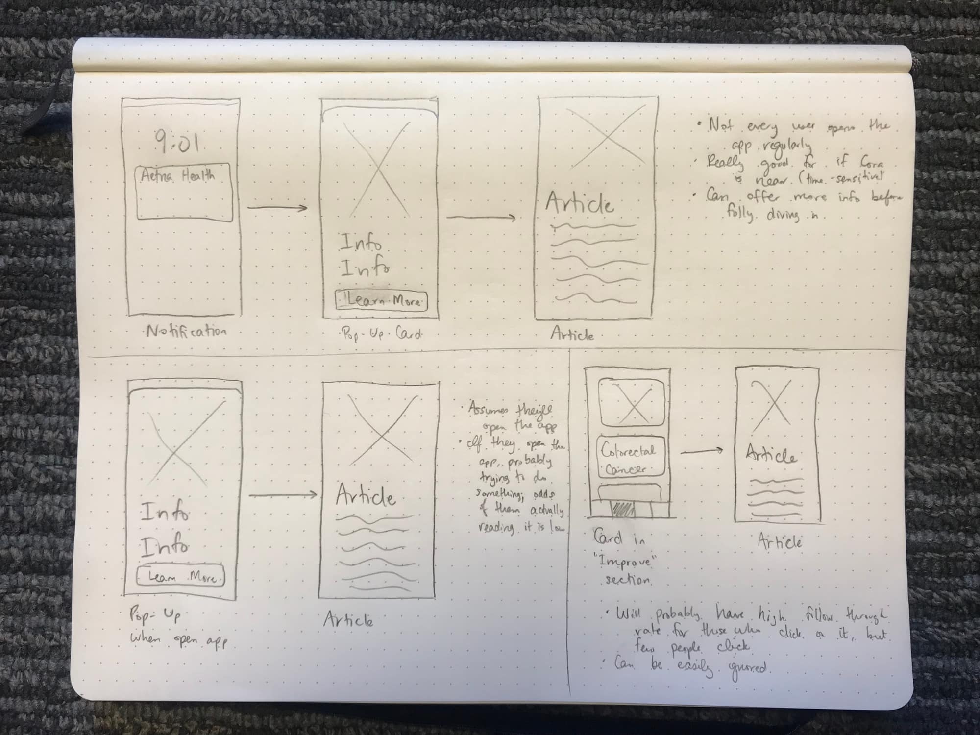
To align with our two goals, we wanted two flows. Each requires a user to be 50+ years old with no record of colorectal cancer screenings in the previous 7 years, or a relative who fits that criteria.
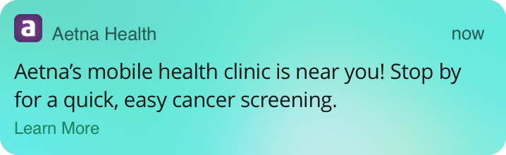
If the Cora truck has a planned stop within 10 miles of this individual, they'll be notified with information related to the mobile clinic.
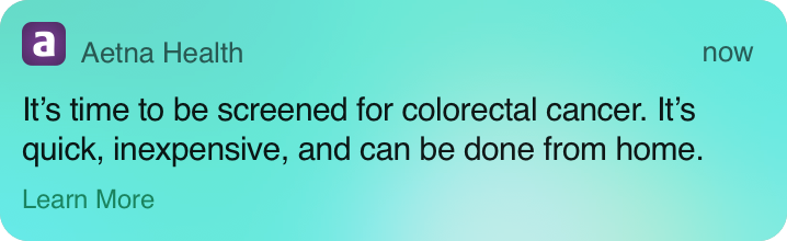
Otherwise, the user will receive information and statistics regarding the importance of screenings.
Goals:
Notification design:
Next step:
Goals:
Notification design:
Next step:
The pop-up has much more flexibility than the notification for actually designing a user interface. Based on the Aetna Health design standards, these pop-ups have a large image covering the top portion of the screen, followed by a few bullet points and a large call-to-action. I followed this design because it helps the team meet our goals - the large visual is appealing and makes it easy to display information in a quick, easily-readable way.
The first design decision that arose was what to display for the image. The image should quickly convey where the Cora truck will be located, and should add some sort of trust in the truck, itself. Because of this, I decided to go with a large map with a location pin, with an image of the Cora truck in the lower-left corner. The remaining information on the screen displays the importance of screening, followed by Aetna Health's large, iOS call-to-action button.
For either user flow, the article was out of my hands. The copy team is in charge of producing this information, so I simply designed the user interface for each of them. The information is expected to be short and succinct with more resources available. I still wanted users to have a quick call-to-action, so the information and resources are split between two different containers.
Working at Aetna Digital on the design team was an incredible experience. Putting to practice the skills that I've learned in a practical working environment was eye-opening. Every design decision was well thought-out, collaboration among designers was prevalent, and the importance of accessibility was always present.
Throughout my summer, in addition to the user flow described above, I enforced design standards and updated numerous screens to follow them; I worked with the sales team to create a fully-featured prototype that they use to recruit new members to Aetna; and I worked with my supervisor on his user stories to design interactions and interfaces for the web application.
The two months spent in Denver dramatically increased my creative confidence and knowledge on working on a design team to create a truly beneficial application. The majority of user stories required research and meetings to learn about how Aetna insurance works, and the user experience research team constantly sent studies for us to check our assumptions. I walked away from the internship a much more competent designer than before, with a much stronger foundation to build my skills from.