Zach Johnson


How do we create a fun, welcoming visual identity for a hackathon? How can we use design to increase the quality and diversity of attendees?
Group projects suck. For this CS 307: Software Engineering 1 class project, my group helps teams track their progress without adding tons of unnecessary overhead.

Frontend designer
January-May, 2018
Alex Hardewig, fullstack developer
Ben Kahlert, fullstack developer
Ian Zanger, backend developer
Sketch, InVision, HTML/CSS, React.js
This is my team's project for CS 307: Software Engineering I. The class's goal was to teach us about agile development by having students create groups and build a software application by the end of the semester. The class was split into 2 sections: planning and development. Planning lasted approximately 2 weeks, which is not very conducive to following a proper UX design process... especially as the only designer on a team of 4 developers. Nevertheless, I pulled my backpack straps tight and did the best that I could. Not to spoil the ending, because things did not go perfectly, but I learned so much and am proud of the project we completed.
The team and I completed some whiteboard brainstorming sessions, talked with our friends and TAs, and developed what we considered to be a pretty good initial list of features for Amora. These were necessary for our Product Backlog, where we listed all of the features we wanted to include. Again, not to spoil the ending, but we iterated a surprising number of times for such a short time crunch, so this document was updated accordingly each time.
Our target users were folks like us — people working on a small group project with a definitive deadline. These folks want to quickly see what work needs to be completed, who needs to complete it, and when it's due. They also want:

As I listed at the top, I was the sole designer for this project. My teammates understood the importance of design, which was fantastic, but ultimately the design depended on me. At this point, with our Product Backlog submitted, we split to plan our various aspects of the application. We had a week to write and submit our Design Document, so time was a bit crunched.
I started this by looking into various applications that serve similar certain aspects of Amora to study and learn about their design decisions. I looked through Discord to learn about how they implemented social server design. Things 3 is a terrific personal task tracker with a simplistic, yet powerful, design. And Spark is an email client that manages to condense the complexities of email into an intuitive, helpful interface.

With these inspirations in mind, I created the first wireframe. It consists of 3 omni-present views:
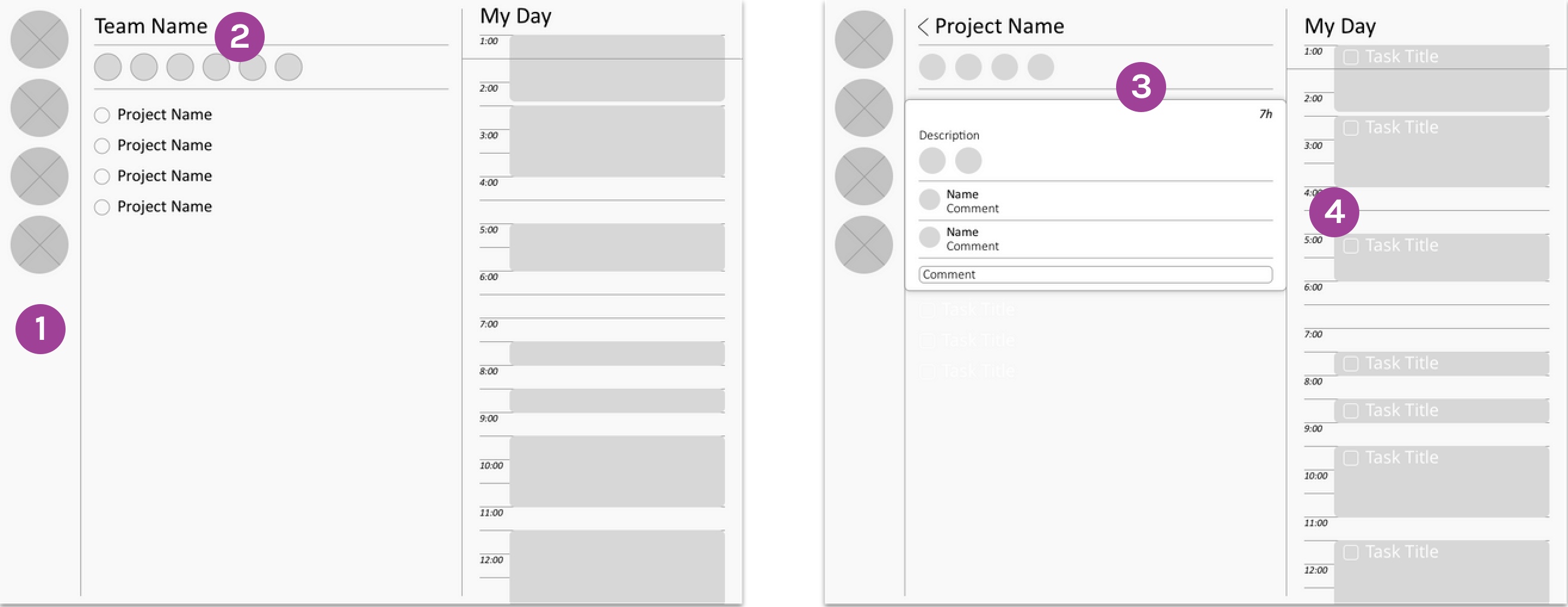
After taking the first wireframe to my team, they mostly liked the design. To be entirely honest, from a user experience perspective, the second wireframe is nearly identical. This iteration, I began to focus on the user interface aspects of the design.

The final iteration came after significant scrutiny from friends in other projects. I updated the colors to be more calming, and changing the font and spacing guidelines helps the application feel genuine and less cluttered — many people we talked to mentioned the original design felt overwhelming. In addition to some UI changes, we also updated some features:

Now that the initial design of Amora was complete, we began coding the web application. To be fair, my teammates did the majority of the logic; I used HTML/CSS to make the website match the aesthetics of the design.
I learned a lot from the experience. Even with a pixel-perfect UI mockup and prototype, it is exceptionally difficult to translate that to a working application. The team tried numerous methods to transfer the design — Zeplin and InVision, to name a few — but we eventually settled on the engineers building the functional webpages, followed by me going through and fixing the HTML/CSS to make it appear as the design intended.

I'll admit that there were many aspects of the application that I forgot to include in my design — settings, messaging, and notifications, to name a few. But overall, this was the first project that I truly worked with a development team to bring one of my designs to life. The prototype is live, if you'd like to see it: https://team4amora.firebaseapp.com/. Overall, there's a lot I'd love to change about the design. I really want to conduct some more user research to confirm some assumptions we made. And there are some last-minute features we had to throw in to meet a grading criteria that really need to be moved in the user flow. But overall, I'm proud of the work my team and I accomplished.